Just because you live in a HDB doesn't mean your home needs to be boring--and by the same vein, neither does your bathroom. Instead, here's some inspiration to transform your boring bathroom into a place that calms you and encourages you to rest, a luxurious space that both you and your guests will love.
1) Go Dark
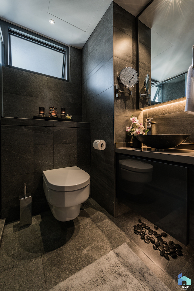
Dark interiors are becoming increasingly popular, but if you don't want to shroud the entire home in a swathe of black or dark browns, why not try out the effect in one room--your bathroom? This will help give you a restful atmosphere--because your eyes don't have to strain to adjust to bright light--and immediately help you to wind down after a long day. One way to do it is to use lots of glass--not for the shy, although there is a panel of frosted glass at the shower area to shield you from any prying eyes. This allows the bathroom to have more light so one doesn't feel claustrophobic. The white sink is a great complement to the black cabinets--love the extra long cabinets for all the bathroom and cleaning supplies, while the overhead and underfloor lighting helps brighten up the space.

 Designed by Aart Boxx Interior, Chai Chee
Feel immediately relaxed and like you're in a spa with aromatherapy candles burning on the ledge above the toilet, and a touch of nature with the flowers in the bathroom. Complementing the dark tiles in the bathroom are strategically placed pebbles--which may or may not give your feet some pampering foot reflexology as well as a comfy bathmat. Use textured tiles on the inside of your shower, to mimic the feel of an outdoor shower that some resorts have. Perhaps the star of this bathroom is the sleek rainfall showerhead, with adjustable settings that might include a massage function.

 Designed by Mr Shopper Studio, Sky Terrace @ Dawson
2) Marble Luxury
If you want lots of light in a small bathroom with just a tiny window, consider an all-white bathroom, made chic with marble tiles across the walls. Pair this with all white furnishings like doors, sink and cabinetry--having cubby holes for extra towels and amenities for guests is a nice and welcoming touch. Even the pipes should be bathed in white paint, if possible. Add lighting strips around the sink area to light up the space.
 Designed by Aart Boxx Interior, Edgedale Plains, Punggol
To give your shower area an immediate touch of luxury, pair black marble tiles with metallics like rose gold for the shower head and for the shelving in the bathroom--they go really well together and makes your bathroom look instantly more polished and like it belongs in a hotel.
![]() Designed by Icon Interior Design, Bukit Batok
Designed by Icon Interior Design, Bukit Batok
Neutral marble tiles in the hues of stone and cream perfectly complement each other, lending a sense of warmth to the space. Choose a sink that's smaller than your countertops to give you additional space to place all your skincare and makeup products, or hide them away in the matching cabinets below. Need to visually widen the space? Here's another bathroom that's not for the shy: the dark tinted glass that separates the bathroom from the bedroom only offers a little privacy, if any at all.
 Designed by Schemacraft Interiors, Racecourse Road
3) Dealing with Exposed Pipes
Probably one of the most head-scratching difficulties is in how to conceal the pipes that run through your bathroom. What this home in Choa Chu Kang did was to coat it in black paint and embrace it as part of the industrial chic aesthetic that their home encapsulates. We love that the tiles here have a worn-in look and don't look perfectly put together--it gives the bathroom a touch of ruggedness.
 Designed by IDID Pte Ltd, Choa Chu Kang St 64
The designers for this bathroom used both dark and and light tiles, visually separating the shower area from the rest of the toilet. To match the neutral scheme, the visible pipes were painted grey and sleek steel hardware with the taps, shower caddy and rainforest shower complete the look.  Designed by Mons Werk Interior Design, Woodlands Drive
4) Patterns, Patterns, Patterns
One of the top trends we've noticed this year is the inclusion of lots of Peranakan-inspired tiles. The trick to doing this--because too many of these colourful tiles can be quite dizzying, unless it sparks joy for you--is to use it sparingly, such as on the floor in this home. We suggest a monochrome grey-and-white colour scheme so it still retains its vivid patterns but in muted shades so it complements instead of overwhelming.
 Designed by Fifth Avenue Interior, Compassvale Crescent
Use these patterned tiles on just one section of the bathroom, as this home in Choa Chu Kang did, on the walls and the floors. Visually enlarge both the bathroom and the surrounding master bedroom with frosted and clear glass and complement the tiles with black accents on the showers, shower tray and cabinets for a touch of industrial chic.
 Designed by IDID Pte Ltd, Choa Chu Kang St 64
Get the feel of a tropical resort in your bathroom with larger tiles, best in just half of your bathroom, and use concrete for the rest of the bathroom. Complete the look with lights flanking the oval mirror, a vintage-looking tap and soap dispenser in dark brown.
 Bathroom designed by Neu Konceptz
Evoke a vintage feel in your bathroom with copper pipes around the bathroom, and more exposed black pipes running around the perimeter. These are paired with sleek cream tiles on two sides of the bathroom and Peranakan tiles on the other--and on the seat in the shower--with super intricate patterns in a neutral colour scheme. We love the brilliant shadows cast by the toilet light.
 Designed by Rezt & Relax Interior Design, Kim Keat
5) Hotel Glam
Follow the aesthetics of most resorts and hotels and opt for a neutral colour scheme but feel free to jazz it up to your own liking. Vary up your textures with smaller black tiles, and grey countertops, with a polished stone sink that matches the countertops perfectly. The second bathroom in this same home features hexagonal tiles instead, that helps to vary up the look while still looking super polished and elegant.

 Designed by Mons Werk Interior Design, Choa Chu Kang Ave 7
We love this home because it actually has a bathtub, a rarity in most HDB homes, but a wonderful luxury if you can fit it into your home (and budget). The mirror that fits the width of the toilet also has loads of storage space, thus leaving the space very clean and clutter-free. Both a shower area and a tub, you can choose which option suits you best--bonus, you'll never have water leaking over to the rest of the bathroom because of the height of the tub. Our only real gripe is that the shower area doesn't really have enough space to put candles--an essential for long baths.

 Designed by Schemacraft Interiors, Park Grove, Yishun
6) A vision in white
Yes, we know the HDB Build-to-Order bathrooms already come with white tile, but it can be a little visually boring. We suggest using white tiles in a brick-like layout to make the space more visually appealing. Add black hardware, frames and shelving for a sleek contrast, and brighten up the sink area with some well-placed lighting.

 Designed by Mr Shopper Studio, Bendemeer Light, Bendemeer Road
Play around with different shapes as well, like the hexagonal mirror in this bathroom as well as the circular ceiling light that helps to diffuse the light. The homeowners went with white tile here, but not all the tiles are exactly homogenous--the ones on the right side of the photo with the window are actually smaller rectangular tiles.
 Designed by Mr Shopper Studio, West Ridges in Bukit Batok
7) Stylish Shelving Solutions
One of the most essential things you'll need to reduce unsightly clutter in the bathroom is storage space. Carve out niches above the toilet or below the sink for extra spaces to stash towels, candles and pretty baskets filled with essentials like extra toothpaste and toilet paper. Having these niches in the shower area is a slightly more sophisticated touch than just having a rack.

 Designed by Aart Boxx Interior, Elias Road
The shower area actually seems quite tiny, but what it loses out in floor space, it more than makes up for in terms of shelving, with two long shelves able to contain all your hair products, and shower gels without any difficulty. The chevron design of the shower area also creates an interesting focal point. We also like the shelf below the mirror, as it can be a tight squeeze to fit soap, toothbrushes and toothpaste, along with any additional makeup products around the rim of the sink without them falling in.
 Designed by Cozy Ideas Interior Design, Pasir Ris
This bathroom packs quite a lot of storage options into one bathroom, beginning with the open shelves on the left of the mirror, where you can put the aesthetically-pleasing pieces like the aromatherapy reed diffusers or ceramics. Behind the mirror is additional shelving for razors, toothbrushes etc., while the cabinets under the sink provides still more storage, while hiding the bulk of the sink.
 Designed by Thom Signature, Choa Chu Kang Ave 1
More Inspiration:
Taking the bathroom from bland to grand
Gorgeous, hotel-worthy bedroom ensuites you'll love
Lust-worthy apartments--emulate these styles for your home
Match these bathrooms to monochromatic homes
Want to engage one of our interior designers? Chat with them, or get a free and personalised recommendation from us and receive $500 Harvey Norman vouchers that you can use to purchase a new refrigerator, washing machine or any of your home essentials. Otherwise, meet them in person at our Home by Hitcheed Meet and Greet on 23 and 24 February at Suntec Convention Centre Hall 403!
![Hitcheed Private Limited [SG]](/assets/homebyhitcheed-728d385d18758a2cb036e11bf01bab977b3b6376ddfdd356b7e5dbe095de874e.png)


